PJW's face, and how to generate it via matplot
I'm trying out a new format here by just exporting a jupyter notebook, so bear with me.
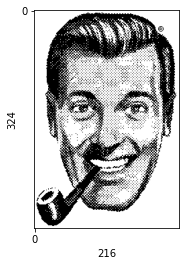
I recently read bwk's Unix: A History and a Memo, and as a result came across the history of the pjw logo. I got interested both because I like the aesthetic style, and also the bell labs gang shenanigans, and it got me wondering how to generate my own. After searching for a while, I only came across a few images of famous pictures such as the mona lisa in the same style, but nothing on how they were generated. So I set out to figure out my own way.
“For some reason, the portrait of Peter Weinberger has always been our most popular target for picture editing experiments. It started a few years ago when Peter was raised to the rank of department head and was careless enough to leave a portrait of himself floating around. On a goofy Saturday evening at the lab, Rob Pike and I started making photocopies and, to emphasize Peter’s rise in the managerial hierarchy, prepared a chart of the Bell Labs Cabinet with his picture stuck in every available slot. Peter must have realized that the best he could do was not to react at all, if at least he wanted to avoid seeing his face 10 feet high on a water tower. Nevertheless, Peter’s picture appeared and reappeared in the most unlikely places in the lab.”
“Within a few weeks after AT&T had revealed the new corporate logo, Tom Duff had made a Peter logo that has since become a symbol for our center. Rob Pike had T-shirts made. Ken Thompson ordered coffee mugs with the Peter logo. And, unavoidably, in the night of September 16, 1985, a Peter logo, 10 feet high, materialized on a water tower nearby. As an ill twist of fate, Peter has meanwhile become my depar tment head at Bell Labs, which makes it very tempting to include him in this collection of faces.” [1]
So on the off-chance that anyone else wants to generate similar images, here's how to do it.
In this case I'm using a dobbshead instead of peter j. weinbergers face, for variety.
import the necessary tools
import numpy as np
import cv2 as cv
import matplotlib.pyplot as plt
from scipy.signal import savgol_filter
# import urllib
read the image and set prettify
I've commented out the parts you'd use for loading the image via an url.
# req = urllib.request.urlopen('https://encrypted-tbn0.gstatic.com/images?q=tbn:ANd9GcRZ4V_IqG1fMlH-ZI8tKHuy4tZu8kd14UWUrA&s')
# im = cv.imdecode(np.asarray(bytearray(req.read()), dtype=np.uint8), cv.IMREAD_GRAYSCALE)
im = cv.imread("Pictures/dobbshead.png", cv.IMREAD_GRAYSCALE)
ret,th = cv.threshold(im, 127, 255, cv.THRESH_BINARY_INV)


# just to make the images not look awful
plt.rcParams['image.cmap'] = 'Grays'
plt.xticks([0])
plt.yticks([0])
plt.xlabel(th.shape[1])
plt.ylabel(th.shape[0])
plt.imshow(th)
<matplotlib.image.AxesImage at 0x7fb9f65e1930>
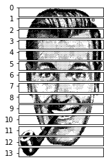
split the image into lines
ysplit = 14
xsplit = 1

M = th.shape[0] // ysplit
N = th.shape[1] // xsplit

tiles = [th[x:x+M,y:y+N] for x in range(0, th.shape[0], M) for y in range(0, th.shape[1], N)]

f, ax = plt.subplots(ysplit, xsplit)
for i, ax in enumerate(ax.ravel()):
    ax.set_yticks([i])
    ax.set_xticks([])
    ax.imshow(tiles[i])
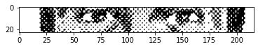
plt.imshow(tiles[6])
<matplotlib.image.AxesImage at 0x7fb9f28d0ac0>
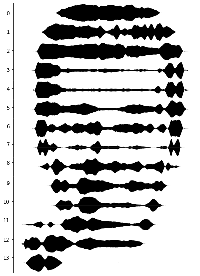
create an array where we add up all the y values to a single one
z = []

for i in range(len(tiles)):
    z.append([])

    for x in range(len(tiles[i][0])):
        total = 0
        for y in range(len(tiles[i])):
            total += 1 if tiles[i][y][x] == 255 else 0

        z[i].append(total)
then we print each line in a subplot
dpi = 32

f, ax = plt.subplots(ysplit , xsplit, figsize=(im.shape[1] / dpi, im.shape[0] / dpi))
for i, ax in enumerate(ax.ravel()):
    # apply [savgol filter](https://en.wikipedia.org/wiki/Savitzky%E2%80%93Golay_filter) to smoothen the curves
    smooth = savgol_filter(z[i], 10, 4)

    # remove unnecessary elements
    ax.set_xticks([])
    ax.set_yticks([i])
    ax.spines[['top', 'right', 'bottom']].set_visible(False)

    # negate all the values
    nsmooth = -np.array(smooth)

    # fill positive and negative space
    ax.fill_between(range(len(smooth)), nsmooth, 0, color='black', interpolate=False, edgecolor=None, lw=0)
    ax.fill_between(range(len(nsmooth)), smooth, 0, color='black', interpolate=False, lw=0)


# remove gaps
plt.subplots_adjust(wspace=0, hspace=0)
- Beyond Photography: The Digital Darkroom